Don't Use Consulting Slides
You need a separate deck for the stage

When it comes to slides, the single most common mistake is to use consulting slides, meaning slides are made to be read on a laptop.
Those are deliberately information-dense, like this:

Unfortunately, such slides are terrible for presentations – not just because of the info-dump complexity, but also because many of your audience members will sit far from the screen and/or have bad eyesight. Don’t use them.
Instead, create a separate presentation deck, with slides that are meant for the stage. For example, here’s how you could redo the slide above:

Reveal text gradually
Use the same logic with individual slides. Specifically, if you show a slide with multiple text elements, you will briefly lose people’s attention as they read everything on it:
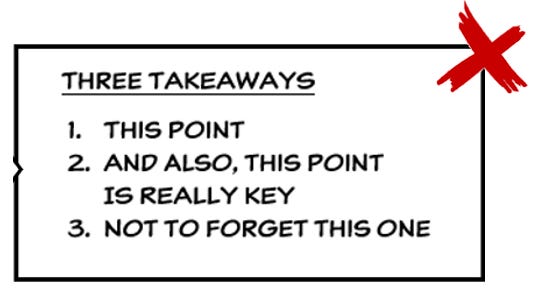
To avoid this, show one point at the time. Like subtitles in a movie, the text should appear in small chunks, tracking your speech:

You do this by using in-slide animations, also called ‘builds’. (Use the animation called ‘appear’ for this, nothing else.) You can also do this for visual elements, process overviews, and more.
